A brand identity is most effective when it reflects the values and aspirations of the organization it represents. Brand logos should also project these same qualities, while also being both simple and easy to recognize at a glance.
Because businesses grow by meeting customer needs, brands and their logos must likewise change with the times. Today’s post-pandemic world, with its raised environmental consciousness clearing the way for electric vehicles and plant-based hamburgers, represents a real turning point for many businesses.
It is therefore no surprise that several major corporations have rebranded already this year, with new logos to follow these cultural changes. While some brands underwent major reconstructions of their logo and color palette, others returned to their roots for a more minimalist visual presentation.
Each of the following rebranding efforts provides an excellent opportunity to explore the intersection between communications strategy and current market trends. With this perspective in mind, our creative agency in Bangkok explores four major logo redesigns in detail.
Pfizer
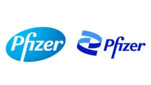
Left to right: Previous and current Pfizer logo
This January, Pfizer redesigned its logo for the first time in 70 years. Rather than remaining known as a mere pharmaceutical company, Pfizer’s new logo integrates a helix shape that strongly resembles DNA – implying investments in cutting-edge biotechnology.
The redesign is both timely and fitting, emphasizing progressive scientific research advancement to combat deadly diseases like COVID-19. This effort will help position Pfizer alongside other rising global brands such as Moderna (whose NASDAQ stock symbol, incidentally, is MRNA).
The new logo signifies that Pfizer has entered a “new era” of scientific research and breakthroughs. The company puts it best in their rebrand promotional video: “We’re unlocking the pill to reveal the DNA at the heart of Pfizer.”
Kia
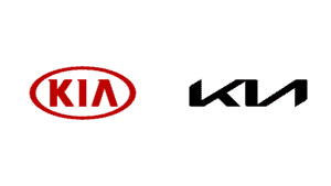
Left to right: Previous and current Kia logo
The global trend toward environmental sustainability has led many brands to focus on environmentally friendly products, such as electric vehicles. Kia is a relative newcomer in this area, but is looking to establish its growing expertise in the minds of the public.
The South Korean automobile manufacturer has accordingly redesigned its company logo to reflect a commitment to electric vehicles. Their new slogan, “Movement that inspires”, likewise suggests technology and innovation.
To express these ideas visually, Kia removed its red circle outline and block letters, replacing them with the letters of “Kia” sharply connected. The diagonal lines in the logo signify action and evolution, to lead the way in a rapidly changing industry.
General Motors

Left to right: Previous and current General Motors logo
As with Kia, General Motors is embracing the image of environmental sustainability. Instead of its traditional dark blue background, General Motors selected a white background with small letters. The negative space below the small “m” represents an electrical plug, while the overall color palette suggests a bright blue sky.
This new logo will fit in well with cultural trends that promote electric vehicles and zero CO2 emissions. It also works as a statement of the company’s new identity and direction, helping employees and customers alike understand what GM now stands for.
Burger King
Left to right: Burger King logos from 1969-1994, 1994-1999, 1999-2021, and current
Burger King’s rebranding aims to – as the brand’s designer Lisa Smith puts it – “improve Burger King’s quality and taste perception”. The company is trying to move away from its previous image of being just another fast food chain with unhealthy, artificial ingredients.
To help change this perception, Burger King replaced its current logo with a logo that closely represents the ones used from 1969-1999. The new logo features a custom typeface called Flame Sans, directly referencing the color of the food to emphasize its quality. Removing the artificial-blue crescent also reinforces Burger King’s new direction toward healthier ingredients.
Moreover, the return to Burger King’s classic logo style also has its origins in pop culture, as shows like Stranger Things have inspired nostalgia among audiences.
Rebranding in 2021 and beyond
As people’s needs and interests change, so will the brands that serve them. To keep your own business relevant in 2021 and beyond, you may need a creative agency in Bangkok to help you rebrand. Contact us today to get started.