In most cases, effective graphic design is a marriage of simplicity and clarity above all else. When designing a logo, these two attributes are even more essential – but there is one more demand on the graphic designer here, and it is a tricky one. An excellent logo must also capture the true spirit of the brand – not only its function, but its attitude, tone, and identity as well.
Companies are like people: Without a clear and attractive personality, they will soon simply fade away into the crowd, unnoticed and unloved. It falls to the branding department to build the right company image, which the entire business will then have to live up to. But it is the visual designer’s work that will make first contact with the public, using colors and fonts to frame the company in the eyes of the world. The hardest and most important step in that process is designing the logo – the symbol of everything the organization truly represents.
A winning logo needs to reflect the company’s relationship with the public, which is why a feel for personality is so central to the design process. Finding that unique company character is a crucial step and one that is often skipped by visual designers who are committed to a single style of artwork. A true graphic artist must devote considerable time to understanding the spirit of the company he is working for and how it wishes to stand out amongst its peers.
Charting the Course
The next step is to get online and research the competition in that field. What types of logos are already in existence? What lessons can be taken from them? What kind of logo would ensure that the client’s business stands out amid all the others? After talking with the client, most visual artists will have a few solid ideas in their heads already. If no other company has used those ideas yet in their logo, that’s terrific – but if they have, then it just means going back to the drawing board.
That drawing board is no metaphor. No matter how good a new computer or tablet might be, pencil and paper are still the best way to play around with new ideas. Colors, signs, and symbols can help enhance the visual impact of an idea, although cultures tend to vary in terms of how such messages are interpreted, and a proper understanding of the intended audience is therefore a necessity.
Looking Through the Eyes of the World
To some degree, the process of filtering out old ideas and generating new ones is a reflection of innate artistic talent, but experience and training can further develop one’s own instincts here. A true artist must have a strong sense of when an image is busy or unbalanced, and when it appears just right. Visual psychology plays an underappreciated role in making these decisions; an artist must have a keen sense of the contrast points where the viewer’s eyes will naturally be drawn at the outset, and where they will then come to rest.
A “hierarchy of information” can effectively be applied to the resulting image: The viewer should first notice the most important piece of information, and then their gaze should move toward their next target, which will contain a secondary or supporting piece of information, and if more needs to be said, a third and subsidiary message can be located nearby so that the eye easily finds it. Practiced manipulation of shapes, colors, and fonts can guide the viewer through the intended path so that the key messages are absorbed in the right order, in an effortless and visually pleasing way.
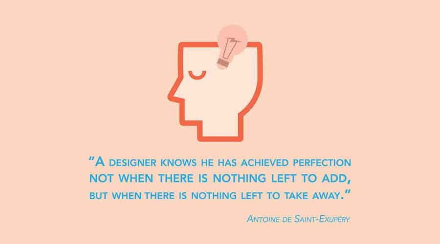
For logos, in particular, once the messages are properly presented and the brand itself is faithfully represented, the extra flourishes can be stripped away to streamline the delivery and produce the maximum effect. As Antoine de Saint-Exupéry once said, “A designer knows he has achieved perfection not when there is nothing left to add, but when there is nothing left to take away.”
Bringing the Message Home
Once the graphic designer has a range of samples ready, it’s time to organize another meeting with the client to get their impression. It’s best for the designer himself to talk the client through this new selection of logo ideas and listen carefully to their feedback. When both client and artist are in agreement on a way forward – making some refinements or putting the finishing touches on one or two rough samples – the designer should get back to the workshop and devote plenty of time to putting together final versions tailored to the client’s specific requests.
Every graphic designer will have their own preferred software, but Adobe has powerful tools for virtually every part of the process. Photoshop is ideal for retouching images, InDesign for layouts, and Illustrator for vector graphics that allow seamless curves at any level of magnification. There’s still room for some visual experimentation in these final stages, and additional meetings with the client are recommended if need be. It may also be worth inviting a colleague to get a pair of fresh eyes on the artwork to see if they have any new ideas or insight.
Toward a Strong Brand Identity
When everything is ready, the final versions should be delivered to the client for their approval. For additional service, the graphic artist may wish to provide them with a style guide on how to use the logo – where to place it on the screen or on paper, how to frame it, its maximum and minimum size, and so on. The rest of the company’s visual identity can then build off the logo, so that its brand can project a strong and coherent skin faithful to the values and research that inspired the design.
From these solid foundations, a company can present a unified, professional, and confident face to the world. Its customers will get an accurate and comforting sense, from the very first instant, of what the company is all about – whether it sells silky dresses, monster trucks, or safaris in Africa.
In an age of mobile phones, short attention spans, and a highly variable range in quality among businesses of all kinds, a reassuring first impression is more important than ever before. Businesses have the chance every day to reach new customers through business cards, websites, social media platforms, and more – all of which feature the company logo. With beautiful and effective art design, that first look could indeed be the beginning of a beautiful friendship.
Lexicon is a full-service digital marketing agency in Bangkok, offering content writing, social media marketing, and graphic design services.
About the Author
David Norcross is an award-winning B2B marketing expert with over 15 years of experience in the industry. He’s the founder and CEO of Lexicon as well as the Chairman of the British Chamber of Commerce in Thailand Digital Marketing Committee.
Lexicon is an award-winning brand storytelling agency focusing on telling impactful stories for clients based in Thailand and South East Asia.